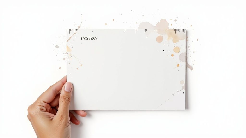
Look, if you're just here for the short answer, here it is: the ideal Open Graph image size is 1200 x 630 pixels. That's the gold standard, giving you a perfect 1.91:1 aspect ratio that just works across major platforms like Facebook and LinkedIn.
Why 1200 x 630 Pixels Is Your Best Bet
Think of your Open Graph image as the first visual handshake when someone shares your link. It’s the book cover for your content. A good one pulls people in. A bad one? It can make your brand look sloppy and push potential readers away.
Sticking to 1200 x 630 pixels isn't about following some random rule; it's about controlling your brand's story. This size became the industry benchmark because it was designed to look great everywhere—from wide desktop monitors to vertical mobile screens.
It’s the sweet spot. You get plenty of room for eye-catching visuals and clear text without creating a massive file that kills your page load speed.
The Technical Rationale
The reason 1200 x 630 pixels is so widely recommended is because it's officially suggested in Facebook's own documentation and has since been adopted by pretty much everyone else. You can dig into the history of Open Graph image sizes to see how we got here, but the bottom line is that this standard works.
The real magic of this standard is that it prevents those awkward, automated crops that butcher your message or slice your logo in half. It’s all about making sure the beautiful image you designed is exactly what your audience sees.
Ultimately, this specific size creates a consistent and reliable experience. When people see a clean, well-composed preview, it signals professionalism and builds trust before they even click. It’s a small detail that makes a huge impact on whether someone clicks through.
- Optimal Display: It fills the entire preview space on most platforms, giving your content maximum visual real estate.
- Clarity on Retina Screens: The high resolution ensures your image stays sharp, even on high-DPI displays.
- Future-Proofing: It's a robust standard that has been reliable for years, so you won't have to redesign everything next month.
To make things easier, here's a quick cheat sheet.
Quick Reference for Social Media Image Sizes
This table sums up the recommended sizes and aspect ratios for the most popular platforms so your shared content always looks its best.
| Platform | Recommended Size (Pixels) | Aspect Ratio |
|---|---|---|
| 1200 x 630 | 1.91:1 | |
| Twitter/X | 1200 x 630 | 1.91:1 |
| 1200 x 630 | 1.91:1 | |
| 1000 x 1500 | 2:3 |
While most platforms have rallied around the 1200 x 630 standard, it's good to be aware of outliers like Pinterest, which favors a vertical format. For general web content, though, you can't go wrong with 1.91:1.
Why Your OG Image Size Actually Matters

Think of your Open Graph image as the digital billboard for your content. When someone shares your link, it’s the very first thing their audience sees, and it has a massive impact on whether they’ll actually click.
Getting the open graph image size right isn't just a technical box to tick; it's a critical lever for performance. A sharp, correctly sized image can dramatically boost engagement and act as a powerful preview that drives up click-through rates (CTR).
In fact, some analyses show that links using the recommended 1200 x 630 pixel size can see engagement jump by as much as 35% compared to those with poorly formatted visuals. This isn’t just about making things look pretty—it's about brand perception and building trust from the first glance.
Building Trust Through Visual Consistency
Let's be real. When you see a shared link with a pixelated, awkwardly cropped, or totally irrelevant image, it screams: "we don't pay attention to the details."
That tiny mistake can make your entire brand feel unprofessional, eroding trust before anyone even lands on your site. It creates a jarring experience that undermines the quality of your content.
On the other hand, a consistently polished and professional visual turns every share into a mini-advertisement that works for you.
A perfect Open Graph image doesn't just represent your content; it represents your brand's commitment to quality. It’s the difference between a confident handshake and a clumsy introduction.
The principles here are closely tied to general image SEO strategies. What works to create a better user experience on social media often aligns with what helps you rank better in search engines. It's all connected.
Connecting Technical Specs to Marketing Goals
At the end of the day, optimizing your OG image is a simple technical task with a direct, measurable impact on your marketing goals. It's one of the easiest wins in content marketing.
Here’s how it connects:
- Higher CTR: A compelling image grabs attention in a noisy feed. More attention means more clicks.
- Increased Engagement: People are far more likely to like, comment on, and reshare posts that are visually appealing.
- Stronger Brand Recall: Consistent, high-quality images reinforce your brand identity every single time your content is shared.
By taking a few moments to nail your open graph image size, you aren't just making your links look better—you're making them work harder for you. This simple step transforms a boring URL into a powerful, click-worthy asset that fuels your growth.
Optimizing Images for Each Social Platform

While the 1200 x 630 pixel image is a solid, all-purpose starting point, assuming it will look perfect everywhere is a rookie mistake. Each social platform has its own quirks and rendering engines that can crop or resize your image in unexpected ways.
To nail your social previews every time, you have to play by their rules. That means getting familiar with the subtle differences in how each network handles your visuals.
Platform Nuances and Key Considerations
Before we dive deeper, it's helpful to see a side-by-side comparison of what the major platforms are looking for. Think of this as your cheat sheet for social media image specs.
| Platform | Ideal Size | Aspect Ratio | Key Considerations |
|---|---|---|---|
| 1200 x 630 px | 1.91:1 | The most reliable platform. Sticks closely to the OG standard with few surprises. | |
| 1200 x 630 px | 1.91:1 | Similar to Facebook, it consistently renders the standard size well across all feeds. | |
| X (Twitter) | 1200 x 600 px | 2:1 | Prefers a slightly wider ratio. It will often crop the top and bottom of a 1.91:1 image. |
As you can see, while Facebook and LinkedIn are pretty straightforward, X (formerly Twitter) likes to do its own thing. This is where a one-size-fits-all approach starts to break down.
Facebook and LinkedIn: The 1.91:1 Standard Bearers
Good news first: Facebook and LinkedIn are your most dependable allies in the Open Graph world. Both platforms are built around the 1.91:1 aspect ratio and display 1200 x 630 pixel images beautifully on both desktop and mobile.
If these are your main channels, sticking to the standard is a no-brainer. You'll get clean, predictable previews without much fuss. They set the baseline for any good OG image strategy.
X (Formerly Twitter) And Its 2:1 Preference
Now for the curveball. While X supports the 1.91:1 ratio, its "summary card with large image" looks much better with a 2:1 aspect ratio. An image sized at 1200 x 600 pixels just feels more native to the platform's UI.
If X is where your audience lives, you have two options: either create a dedicated image just for X, or design your main 1200 x 630 image with that 2:1 crop in mind. A great way to check your work is to generate a test X screenshot before hitting publish.
The key takeaway is that X will often crop the top and bottom of a 1.91:1 image to fit its preferred 2:1 card. This is where designing for a "safe zone" becomes critical.
Designing for Safe Zones
The "safe zone" is the central part of your image that won't get chopped off, regardless of which platform shows it. It's where you need to put all the important stuff—your logo, your headline, and key visuals.
Picture your 1200 x 630 pixel canvas. The central 1200 x 600 pixel area is your safe zone, especially for appeasing X. By keeping your critical content away from the top and bottom 15 pixels, you can ensure your message doesn't get butchered.
Here’s a simple checklist for designing with a safe zone:
- Core Message: Keep your main headline and text smack in the middle.
- Logos and Branding: Make sure any logos or brand marks are comfortably inside this central area.
- Background Visuals: It's fine for less important background textures or images to bleed to the full edges. They're expendable.
This strategy gives you the best of both worlds. Your image is optimized for the most common standard, but it's also resilient enough to handle the quirky crops from platforms like X. It’s a smart, defensive design tactic that keeps your brand looking sharp everywhere.
How to Implement Your Open Graph Image
Right, so you've nailed down the perfect Open Graph image size. Great start, but it's useless until you actually tell social media platforms where to find it.
This is where you connect the dots in your page’s HTML <head> section. All it takes is a few simple meta tags to point crawlers in the right direction.
The star of the show here is the og:image property. This tag is a direct command, pointing crawlers to the exact URL of the image you want them to show. It's a simple line of code, but it carries all the weight.
You can't just drop the image URL in and hope for the best, though. You need to be explicit to avoid any guesswork.
The Essential Code Snippets
To get your link previews loading quickly and correctly, you need to provide more than just the image URL. When you specify the dimensions, you're helping the platform pre-allocate space for your image before it even downloads it. This detail speeds up the whole rendering process.
Here are the essential tags you’ll need in your HTML:
Think of this block of code as an instruction manual for the link preview. You're not just saying, "Here's an image." You're giving clear directions: "Here's a JPEG image, it's exactly 1200 pixels wide by 630 pixels tall, and you can find it at this specific address." This clarity leaves nothing to chance.
One non-negotiable rule: always use an absolute URL for your
og:imagepath. A relative path like/images/your-og-image.jpgwill break because social media crawlers won’t know your domain. An absolute path gives them the full, unambiguous address.
File Formats and Compression
The file format you choose also makes a difference, mostly for performance. The choice usually comes down to two main contenders: JPEG or PNG.
- JPEG (.jpg): This is your workhorse. JPEGs are perfect for photos or complex images because they offer fantastic compression, keeping file sizes small. For an
og:image, a smaller file means a faster-loading preview. - PNG (.png): Reach for a PNG if your image has a lot of text, logos with sharp lines, or needs a transparent background. The tradeoff is often a larger file size, so make sure you run it through a compression tool.
Whatever you choose, try to keep your image file under 5MB. Anything larger might get ignored by some platforms, so play it safe.
These standards have come a long way since the Open Graph protocol was first introduced by Facebook back in 2010. The current 1200 x 630 pixel recommendation strikes a great balance between looking sharp on modern screens and fitting well across different devices. If you're curious about the history and how we got here, you can discover more insights on OG image dimensions. Ultimately, getting the implementation right is what makes it all work.
How to Test and Debug Your OG Images
Setting your Open Graph image tags and just hoping for the best isn't a strategy. If you want your links to look perfect every time they're shared, you have to test and debug them before you publish. This final step is non-negotiable if you want to dodge those dreaded, broken social media previews.
Luckily, the major social platforms give us official tools to do exactly this. Think of them as a real-world preview—they show you precisely how their crawlers see your page and what your shared link will look like in a live feed. This isn't just a simulation; it's the real deal.
Using the Official Platform Debuggers
Each platform has its own validator tool. The best workflow is to run your URL through each one that matters to your audience. This is how you catch platform-specific quirks, like how X might crop an image differently than Facebook.
These are the three tools you should have bookmarked:
- Facebook Sharing Debugger: The OG and still the most important one. It shows you exactly what metadata Facebook scrapes from your URL.
- X Card Validator: Essential for making sure your preview looks sharp on X and follows its preferred aspect ratios.
- LinkedIn Post Inspector: Works just like the others, giving you a clear preview of how your link will show up in a professional feed.
Here’s a look at what the Facebook Sharing Debugger shows when you plug in a URL.
The tool gives you a clean preview, lists all the Open Graph properties it found, and flags any warnings or errors it runs into.
If you're looking for a more unified approach, you can also use a comprehensive website metadata debugger that checks multiple platforms at once.
Fixing Common OG Image Issues
When you run a URL through these tools, you'll eventually hit an error. Don’t panic. Most are easy to fix once you know what you're looking for. For a deeper dive into the whole process, check out this guide on mastering your Open Graph preview and debugging.
One of the most common headaches is caching. If you update an OG image but the old one stubbornly keeps appearing, it's because the platform has a saved version. Every debugger tool has a "Scrape Again" or "Refetch" button—this button is your best friend. Click it to force the crawler to grab the latest version of your page.
Other frequent culprits include incorrect dimensions, oversized files (always keep it under 5MB), or using relative URLs instead of absolute ones in your og:image tag. The good news is the debuggers will flag these problems for you, so you can fix them quickly and make sure your content always puts its best foot forward.
Automating Your Open Graph Image Creation
Let's be honest: manually creating a unique Open Graph image for every blog post, product page, and support article is a massive headache. It's a tedious process that grinds your content pipeline to a halt and becomes unmanageable as your site grows. This is why so many websites give up and use a generic, one-size-fits-all image that does nothing to stand out in a crowded social feed.
But there’s a much smarter way to do this.
You can automate the entire process, dynamically generating perfectly branded, context-aware OG images for every single page on your site. This simple shift turns a soul-crushing chore into a completely hands-off part of your publishing workflow.
The idea is to use templates and an API to pull data directly from your content—like the page title, author's name, or featured image—and plug it into a pre-designed layout. The end result? A unique, professional-looking image for every URL, created in an instant without anyone on your team touching a design tool.
How Dynamic Generation Works
The core concept is surprisingly simple: treat your OG images like tiny, dynamic web pages. You build a template with HTML and CSS, and an API renders that template into an image file whenever it's needed. This method guarantees every open graph image size is spot-on and your branding stays consistent across thousands of pages.
Here’s a peek at an API service built specifically for this, designed to turn a simple URL or snippet of HTML into a polished image.

Services like this one essentially fire up a headless browser to "screenshot" the web page template you've designed, saving it as your final OG image. It's a clever and powerful approach.
For developers who want to integrate this directly into their applications, a website screenshot and HTML-to-image API is the engine that makes it all possible.
The payoff for setting this up is huge:
- Scalability: You can generate thousands of unique images without lifting a finger. It just works.
- Brand Consistency: Every single image automatically follows your brand guidelines, no exceptions.
- Time Savings: Think of the countless hours you'll free up for your design and content teams.
- Improved CTR: Let's face it, context-specific images with clear, bold titles are far more engaging and clickable than generic logos.
By bringing automation into the mix, you can finally ensure every link shared from your site looks exactly the way you want it to—driving more traffic and reinforcing your brand identity with zero ongoing effort.
Got More Questions About OG Images?
It's normal to have a few lingering questions. Let's tackle some of the most common snags people hit when trying to get their Open Graph image size just right.
What Happens If My OG Image Is Too Small?
If you go smaller than the recommended minimum—usually about 600px wide—you're rolling the dice. The social platform might just give up and show a preview with no image at all.
Worse, it might try to stretch your tiny image to fit, leaving you with a blurry, pixelated mess. And in the worst-case scenario? The crawler gets confused and plucks a random, often irrelevant, image from your page. It's not a good look.
Can I Use a PNG File for My OG Image?
You bet. Both JPEG and PNG are universally supported, so the real question is which one is right for your specific image.
- JPEGs are your best friend for photos and complex images with lots of colors. Their compression is top-notch for keeping file sizes small without a noticeable drop in quality.
- PNGs are the clear winner for images with sharp lines, crisp text, or if you need a transparent background.
Just keep a close eye on the file size. No matter which format you choose, make sure the final image stays under the platform's limit. A good rule of thumb is to keep it under 5MB, as networks like Facebook will reject anything larger. An oversized file is one of the most common reasons a social preview fails to show up.
How Do I Force an Update to a Cached OG Image?
Ah, the classic headache. You’ve fixed the og:image tag, pushed the update, but the old, wrong preview is still showing up. That’s because the platforms cache that data to keep things speedy.
To bust that cache, you need to use the platform’s official debugging tool. For Facebook, that’s the Sharing Debugger. Just paste your URL in, click the "Scrape Again" button, and it'll force their crawler to re-fetch your page and pull in your fresh new image.
Ready to stop worrying about social previews and automate the whole process? With Capture, you can generate beautiful, on-brand Open Graph images for thousands of pages without lifting a finger. Ditch the tedious design work and let an API handle it all. Get started for free at capture.page.